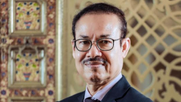
Reesham Shahab Tirtho: An artist, an architect and a fan of Game of Thrones
Reesham Shahab started a multidisciplinary studio, ‘Studio Terracotta’, with the goal of practising rational, sustainable and climate-responsive architecture, and ‘Tirthosthan’, an organisation that explores the art and graphic design fields
A hairy, bald man wearing a blue lungi is standing in front of a table fan, with his back to the fan. The breeze coming from that fan is blowing the lungi, and with closed eyes, the man stands. Imagine the classic image of Marilyn Monroe where her white skirt blows, but instead of her, a lungi-wearing Bangalee man is standing to enjoy the breeze.
It was probably the summer of 2020 when this cartoon emerged, and I immediately searched for the artist. It was Reesham Shahab Tirtho, an architect who was popular for his illustrations and graphic designs.
Not just cartoons, Tirtho has designed book covers, T-shirts, corporate branding, and made promotional art for companies like Brac, Apex Footwear, Dominos Pizza, Uber, Chaldal, City bank, Grameenphone, etc.
 Keep updated, follow The Business Standard's Google news channel
Reesham Shahab started a multidisciplinary studio, 'Studio Terracotta' in 2015 with the goal of practising rational, sustainable and climate-responsive architecture.
Tirthosthan, a sister concern of Studio Terracotta, explores the art and graphic design fields. It is a nine-member team that includes their cat named Mewbius. Barring the academic pedigree of Mewbius, the other eight have studied architecture and diversified into pursuing art.

To know more about his life and creative ideas, The Business Standard reached out to Reesham Shahab Tirtho.
You majored in architecture and then became popular as an artist and illustrator. Tell us about the journey.
I used to draw and doodle since my childhood but did not get the opportunity for institutional training. I majored in architecture from Buet and during the five years I spent obtaining my degree, it was tough to concentrate on anything other than my studies. I am not a multi-tasker, so it was mostly something I was doing for myself. After graduating, I continued to draw as usual.
After I eventually got a job, I continued working for six years, got married, and had a baby boy in 2013. Basically, life happened, and I got busier. I drifted away from art.
But then, something terrible happened – my baby boy died in 2014, and grief engulfed me. So, I looked for something which could give me peace. I did not know what to do. I quit my job and joined a university as a teacher and then started drawing and illustrating again in my free time.

In those last seven or eight years, I was not active on Facebook. In 2016, I started to re-explore that platform and posted my work there for my friends and family. One day the founding members of Context BD contacted me and asked me to illustrate for their website. So I made comics and art for them voluntarily.
My art gradually gained traction on social media, and later I started receiving jobs for professional commissioned work. In 2018, I did my first interior mural installation for UL VS, a multinational company.
After that, I started to get more work. After my mural installations, people started commissioning me for graphic and branding designs.
Your works are vibrant and very colourful. Then we see the iconic architectural structures in your works. Why is that?
The pieces that you see mostly are commissioned by corporate companies for commercial spaces. Clients have demands that we try to fulfil.
While a visual artist or painter first creates their art and sells their piece, we listen to the client's requirements and then create our piece.
It is mainly a part of our client's requirements to portray the cityscape and to use vibrant colours.
For example, Chitrogolpo, a Bangladeshi wedding planning and photography company, requested to showcase the little details that make a traditional Bangladeshi wedding special and vibrant, which we tried to incorporate those elements into our design.

Brand colour is another important factor that needs to be included in the final piece. For example, bright fuchsia or pink is Brac's brand colour. If you look at the pieces we created for them, you will find that colour is one of the most prominent ones.
So can we say that using vibrant colours is your signature style?
We actually do not want to be handcuffed to any style; in fact, we have a problem with the word 'style'. I feel like when an artist establishes a style, the audience likes to confine the artist within it, making it tough for artists to break the pattern.
While we have several works that feature vibrant colours, we also have works that are rustic, monochromatic, black and white and even with no colours.
And then we experiment with different techniques as well. For wall murals and graffiti – we use digital print, ceramic, paint, metal, wood etc.
The figures in your pieces have a smooth shape, circles and semicircles - almost deconstructed. Why is that?
For architects, perfect shape and form, measured lines and corners are important drawing components. We tend to lean towards logic, function, and forms that work together. We have only a little leeway to break the rules or logical forms.
A trained artist does not have that kind of restriction, so they can explore more abstract forms.
Impressionist artists like Paul Cezanne and Henri Matisse have already worked with such deconstructed forms. We are also inspired by the abstract artists and sculptors like Mark Rothko, Wassily Kandinsky, Alexander Calder, Henry Moore, Constantin Brancusi and so on. We studied their works and realised that there is a scope to work with their forms and abstract ideas. That is how we incorporated irregular organic shapes.
Game of Thrones and Pahela Baishakh – how did that crazy mash-up happen?
I was a big fan of the show until the final season. The 8th season just broke my heart and I could not come to terms with the ending.

Anyways, as the season premiered on the day of Pahela Baishakh in 2019, I decided to make something special and incorporated the show's characters into the design.
You have worked with several corporate groups, which are now incorporating illustration and graphic designs into their branding. How do you see this change? And what are the challenges that you face?
Although illustration based storytelling in the corporate area has not been a popular medium for the corporations in our country, it is not new for us.
In the late '80s and '90s, artist Rafiqun Nabi (popularly known as Ranabi) worked with Alauddin sweets when he created cartoons for the company. Then Amul used illustrations and cartoons for a long time for their branding.
Industrial graffiti is trending all over the world. As a continuation of the trend, the style has been gaining traction locally.
I also want to say that this trend is not going to last for very long because trends change their track and then return after years.

In the '50s, '60s and '70s, graphics and illustration were popular in the West. As technology started to rise, abstract graphics became popular, showing how trends do not last. If you talk about challenges, I would say many clients are not open to experimentations. Sometimes they don't really know what they want. So it takes a lot of time and effort to arrive on the same page. And then sometimes clients are not very professional in terms of remuneration and commitment as well.
But still here at Tirthosthan and Studio Terracotta, we work hard to bring something new to the table, no matter how hard it is.